Craft and production work behind the screens.
Coursework, client production and 3D. This is where I practised the constraints of real media: legibility at a distance, a brand on a deadline, and a booklet people carry through a room.
My first UI/UX course: research first, then five screens.
Orenda was a rural homestay app concept from Interface Design (AKMD2114), my first UI/UX course and my first project in Figma.
My part was the Airbnb teardown, measured on its profile screen across layout, hierarchy, visual noise, iconography and colour, and five pages — Home, Explore, Profile, Inbox and Direct messages — each taken from a grey-box wireframe to hi-fi.
Comparing four booking apps on the same five axes produced one rule: if two elements share the same visual weight, one of them should lead.
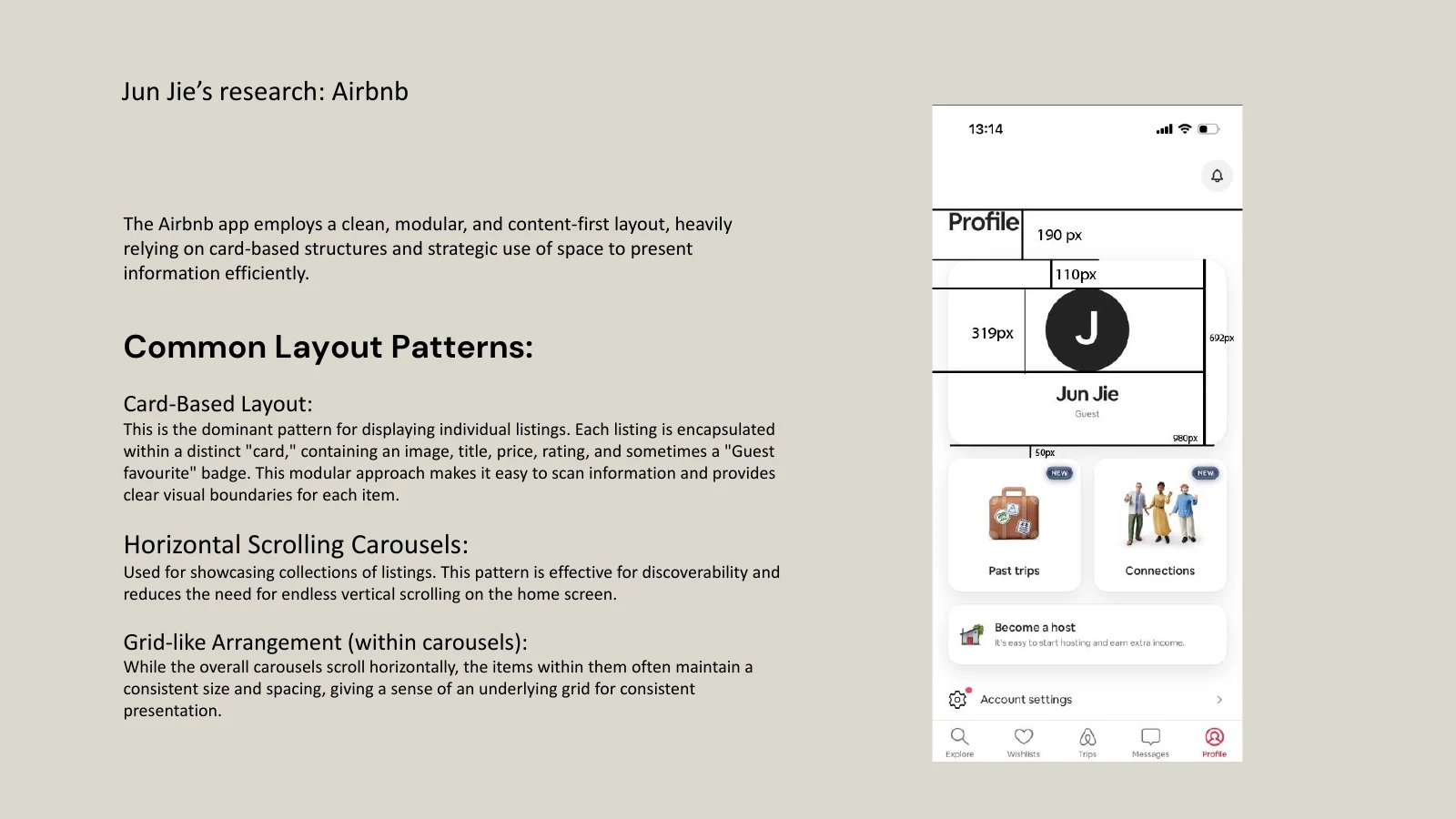
Fig. 01My Airbnb teardown: the profile screen measured in pixels, beside the layout patterns it relies on.
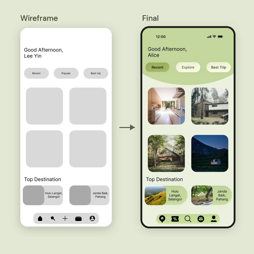

Fig. 02Home and Explore Story, wireframe to final. The grey-box structure carried into hi-fi almost unchanged.
Event graphics have to read from across a banquet hall.
For EcoShop’s annual night I designed the seat map and the UI for the event screens, which the IT team then built in Unity. The seat map is the piece I’d point at: it is information design under pressure.
77 numbered tables, the VVIP and VIP placings, the halal and non-halal split and every emergency door have to read at a glance for someone standing at the entrance. Colour carries the halal split; numbers carry everything else.
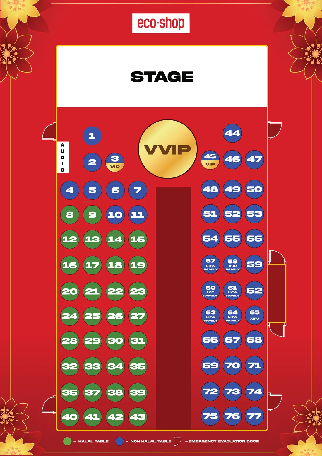
Fig. 03Green for halal, blue for non-halal, gold for VIP, and the evacuation doors marked along the walls.
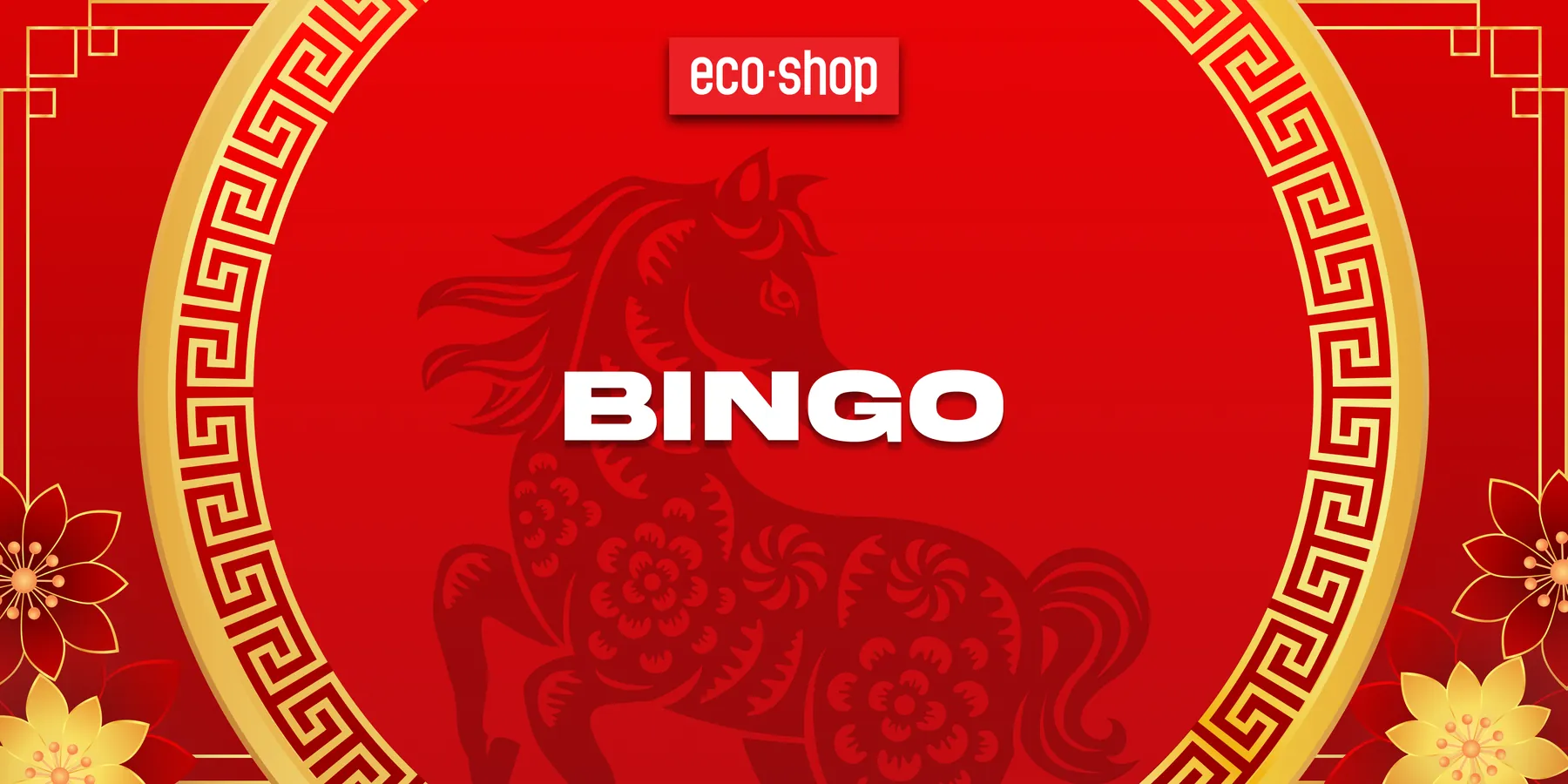
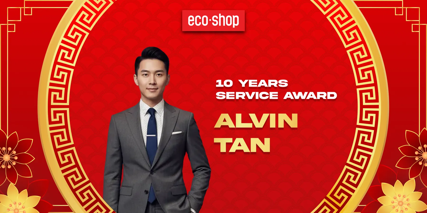
Fig. 04My screen UI for the night, built in Unity by the IT team: one frame, reused for the bingo game and the service awards.
A lesson on how technology changed, told through things students have held.
UOB My Digital Space is UOB’s digital-literacy programme for young people, delivered with Virtualtech Frontier. Its topics run from AI and cyber safety to entrepreneurship and the metaverse.
I built the deck for Module 1.1, The Digital Time Capsule: 17 slides on how technology evolved. It opens on a question every student can answer — waiting three seconds for a video to load — then sets a floppy disk’s 1.44 MB beside a phone’s 128,000 MB, so the scale of change is a number they can feel rather than a claim.
From there the deck moves from what changed to why it changed, arrives at AI, and closes on three reflection questions and one line: how we use technology responsibly matters even more.
I also designed the programme’s five achievement badges — their titles and their layout. The mascot is VTF’s own character, and the key visual was made by a team of four, my mentor included.
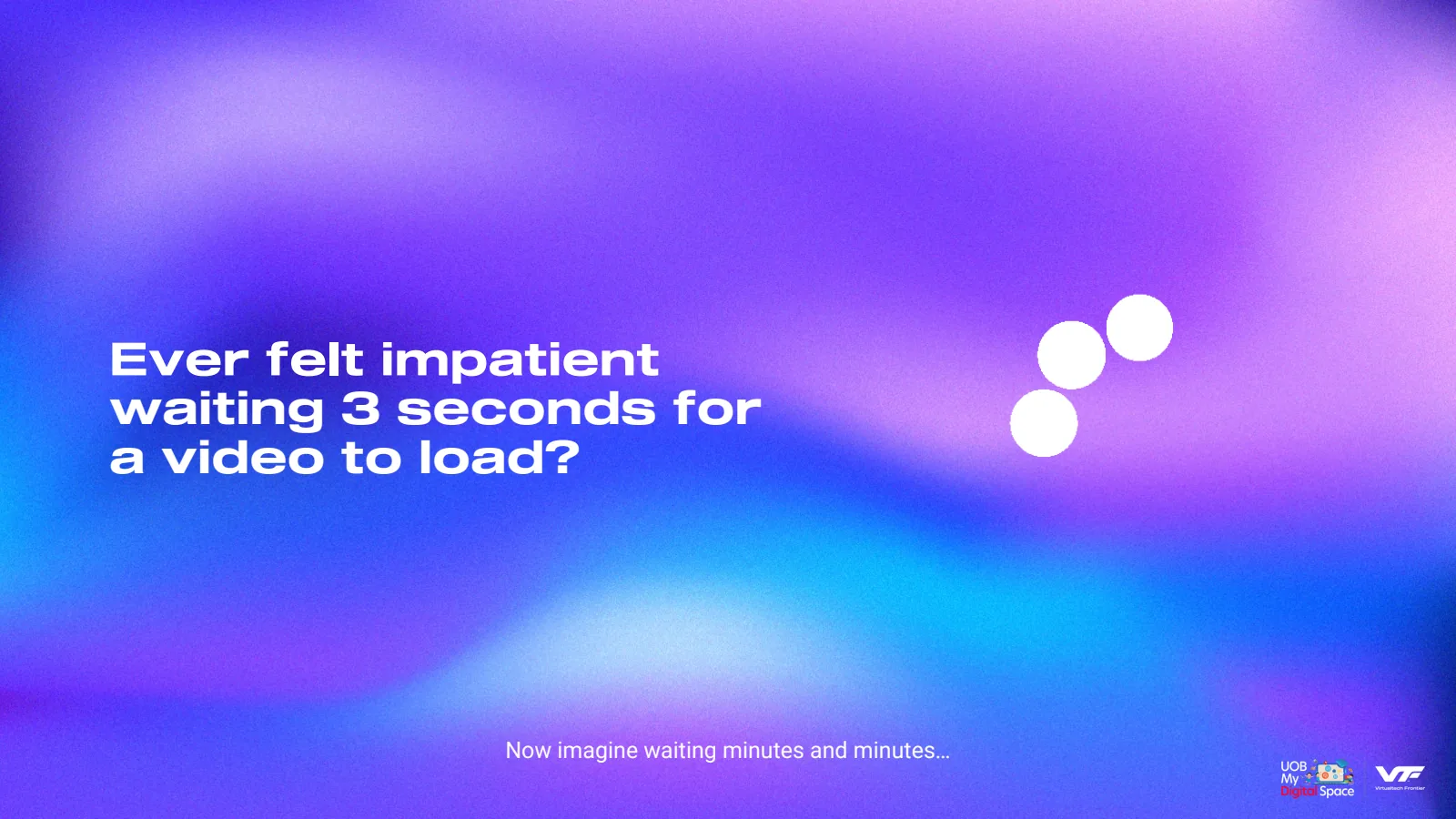
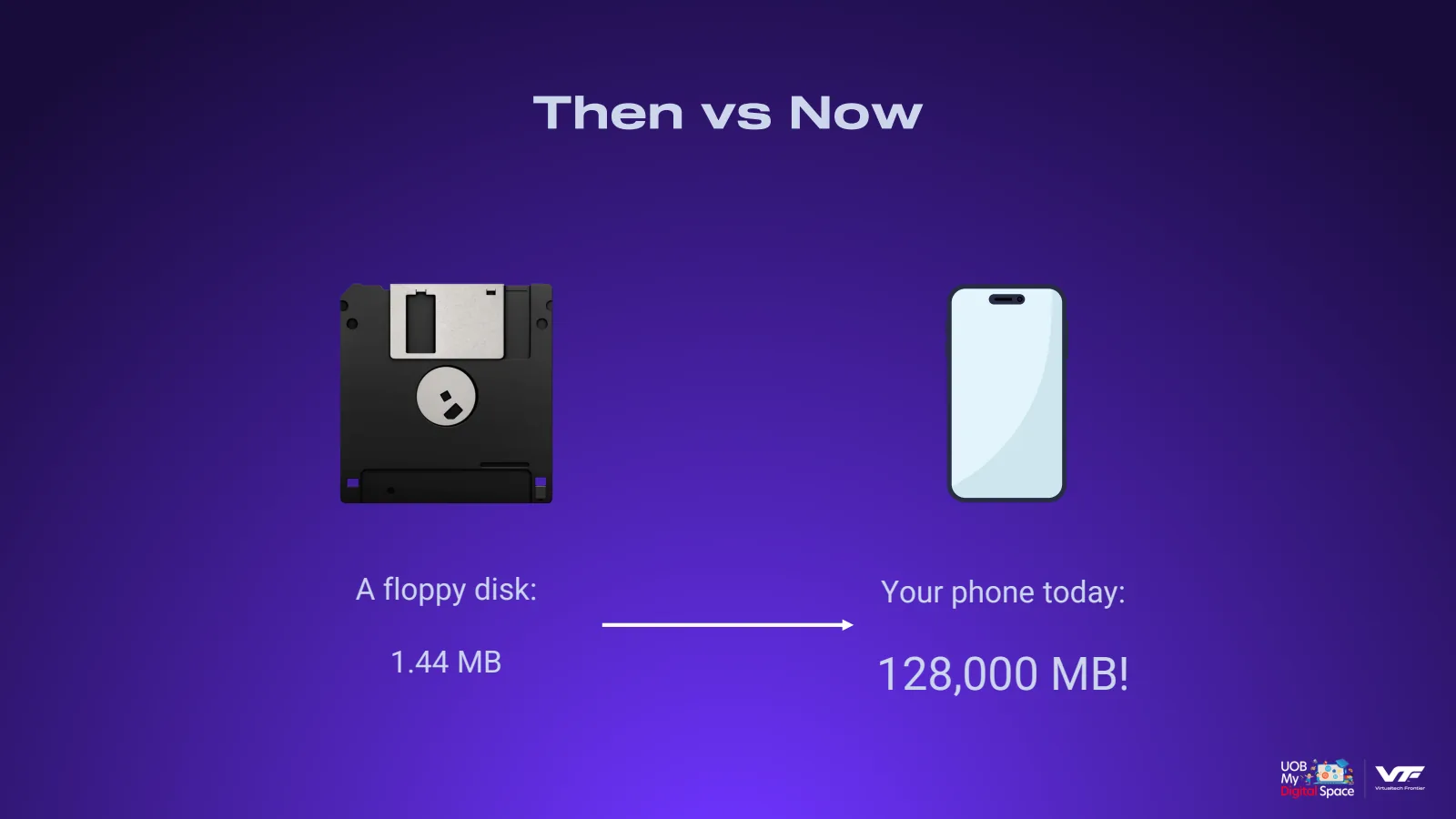
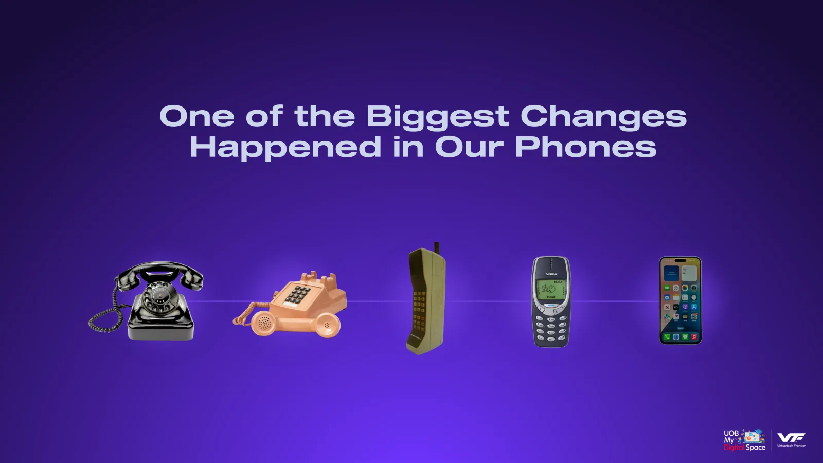
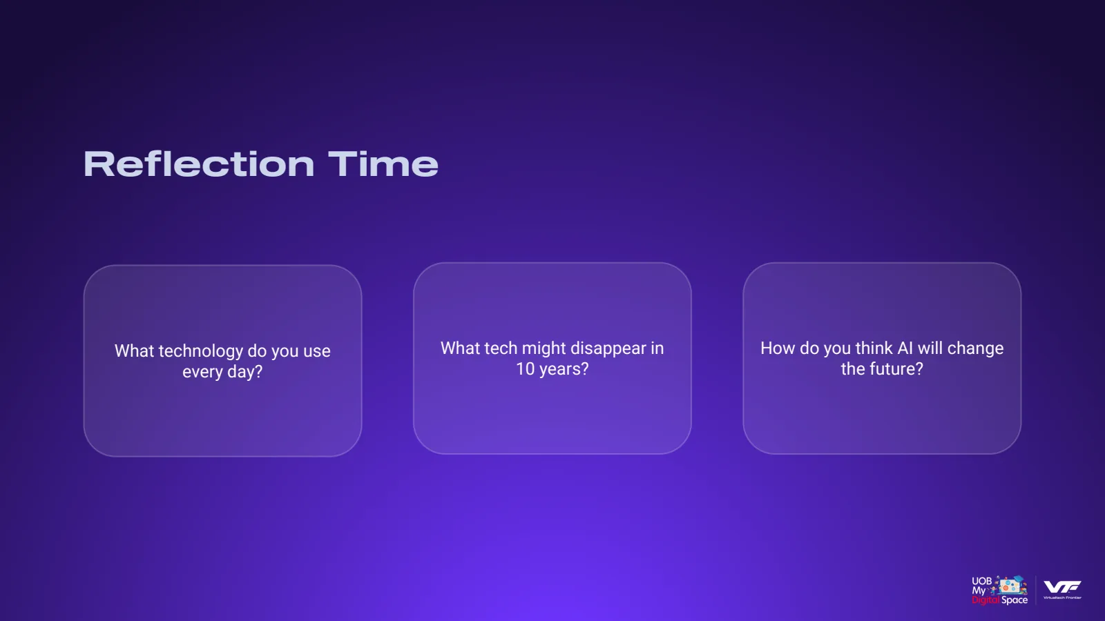
Fig. 05Four of the 17 slides: the opening question, the floppy disk against a phone, the telephone timeline and the reflection questions. This is the deck as I left it in March 2026; the team has updated it since.

Fig. 06The five badges. Each title names a digital skill, and the mascot’s prop carries it: a light bulb, a chat bubble, a puzzle piece, a raised fist, a clipboard. Mascot renders by the VTF team.
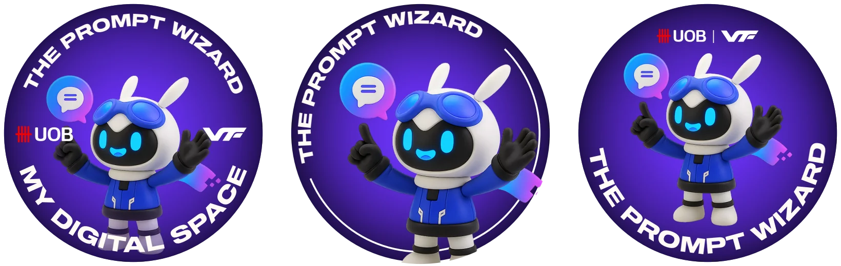
Fig. 07Three layout directions for the same badge: logos either side, the mascot cropped large with no logos, and the logos moved to the top.
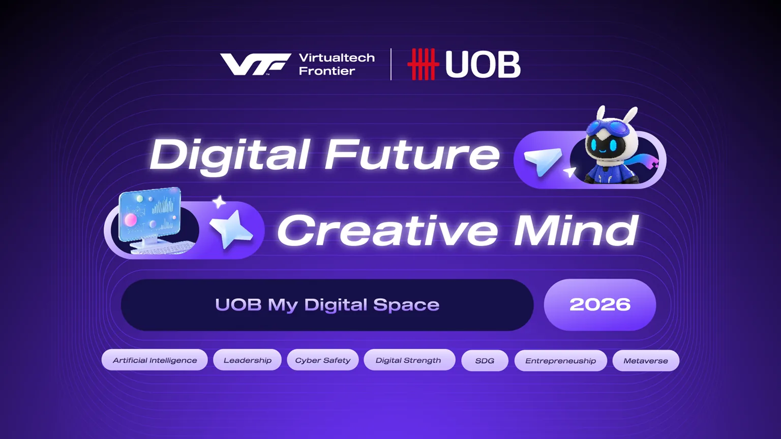
Fig. 08The programme key visual, co-designed by a team of four including my mentor.
A guidebook that is part of the attraction, not a leaflet about it.
Enchanted Forest is an immersive indoor forest experience, and its guidebook has to lead visitors through it without breaking the spell.
The inside spread is the route itself: nine numbered zones along one path, each with a stamp to collect and a badge to return at the end. The booklet becomes something to complete rather than something to throw away.
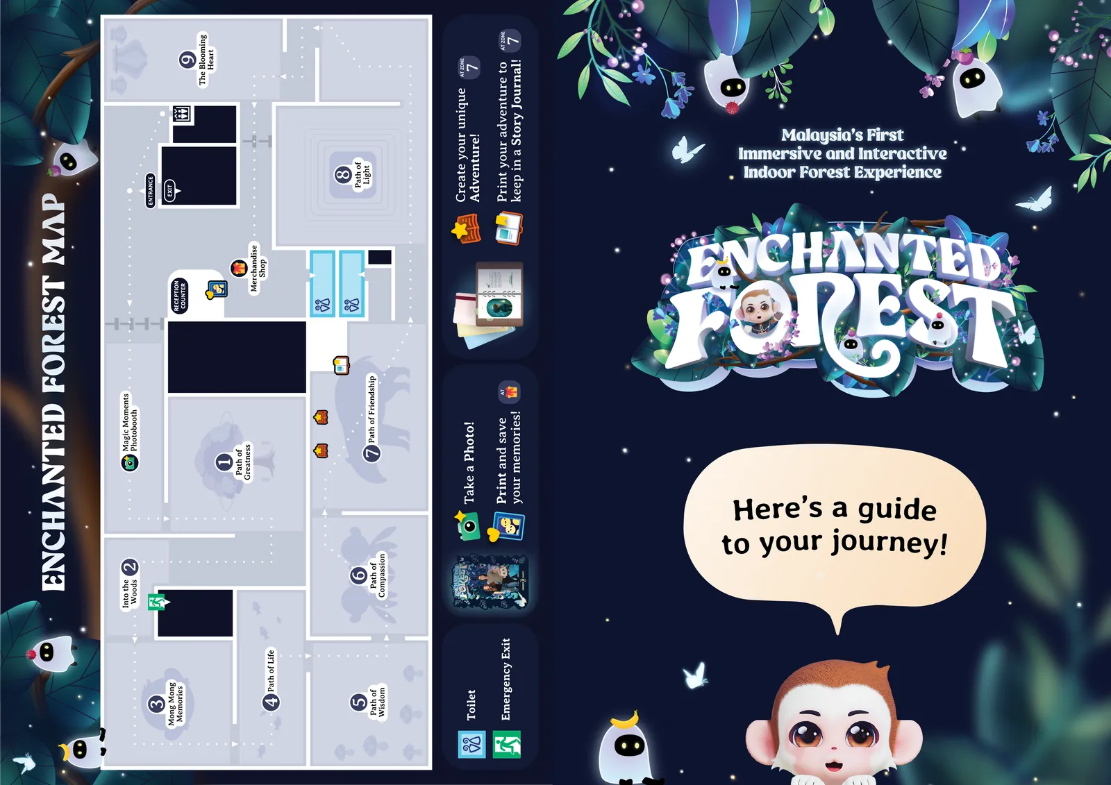
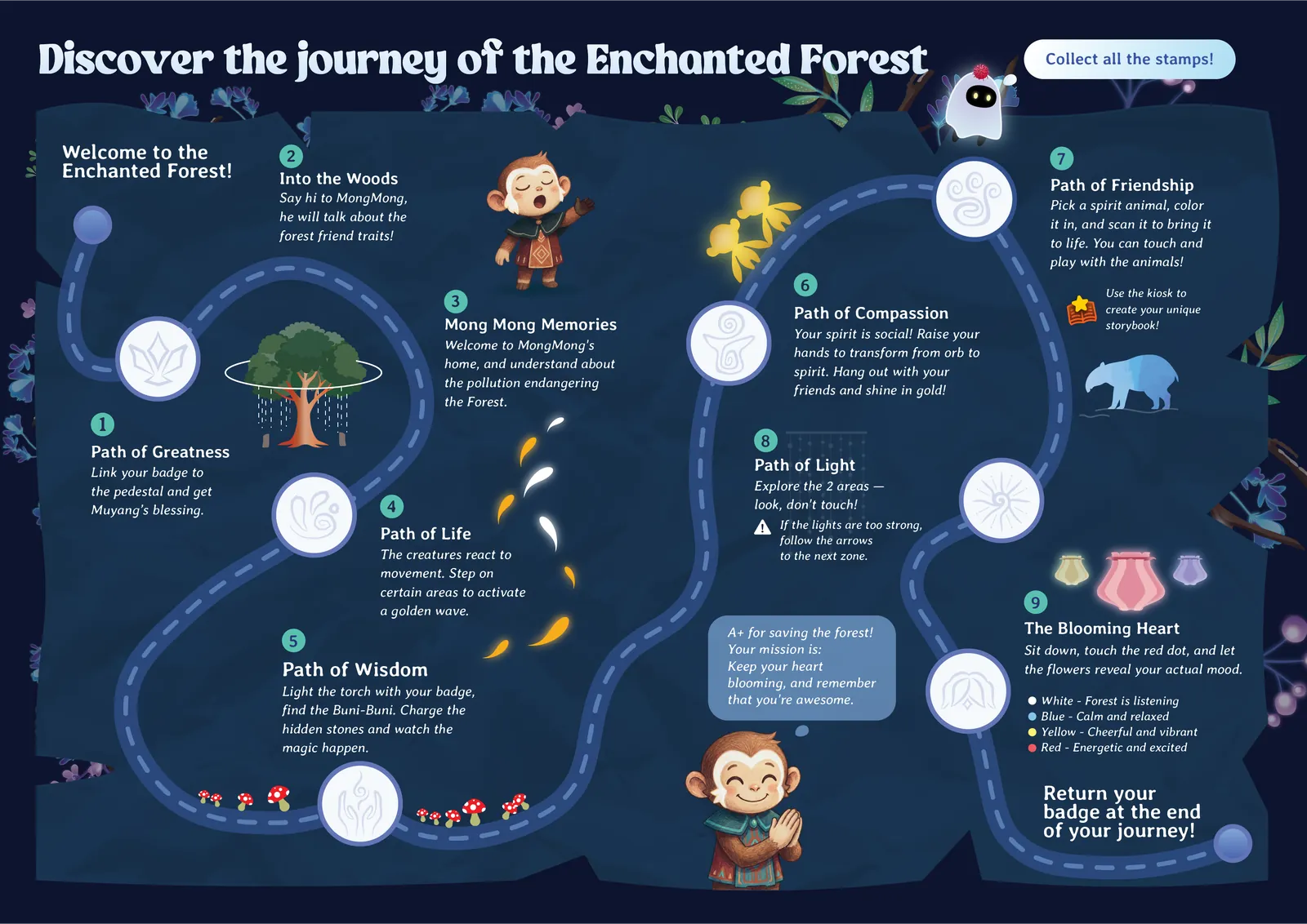
Fig. 09Outside, the floor map and cover; inside, the trail. Each white circle on the path is a stamp station.
A corporate logo and a festival on one card, without a fight.
Greeting cards for Dynatrace, for Chinese New Year and Hari Raya, reworked with feedback from the client and a senior designer.
The work is balance: large festive headings and traditional motifs, with the company logo still clearly the sender. Client feedback taught me to design for the business behind the card, not for my own taste.

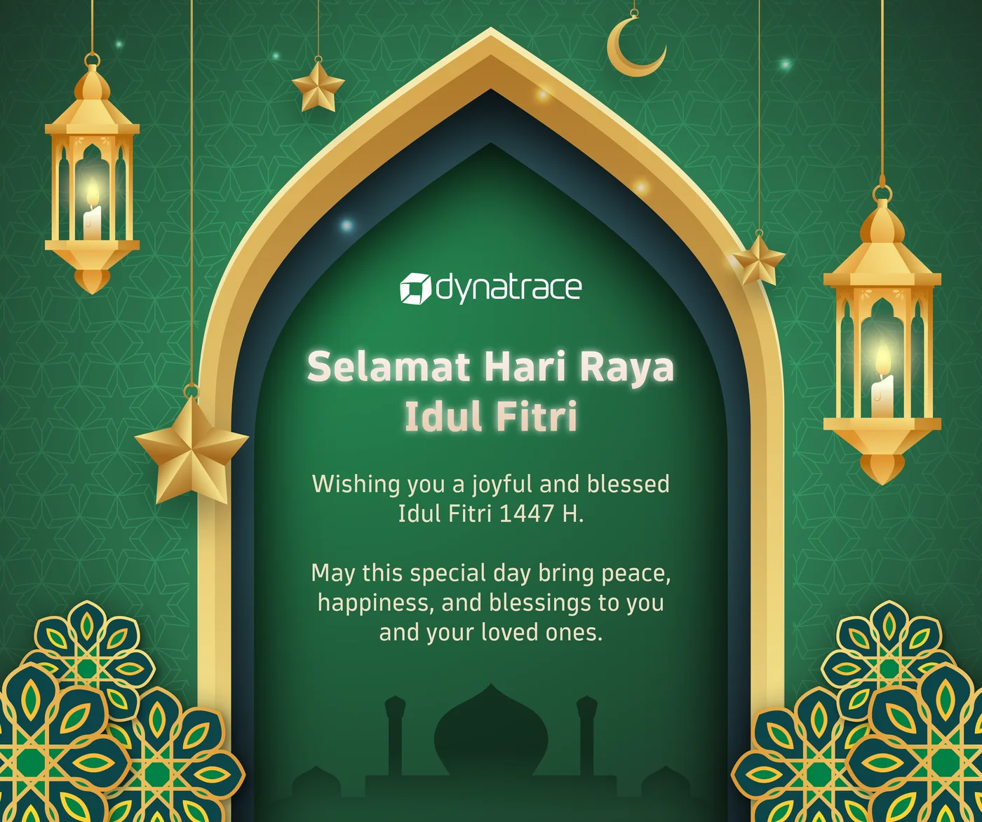
Fig. 10Chinese New Year and Hari Raya. In both, the logo sits directly above the greeting.
Light, material and camera, practised on one kitchen island.
A kitchen island modelled, lit and rendered in 3ds Max from nine angles: stone, timber and a strip of warm light under the counter.
It is the same literacy the MyXR panels needed, because a panel in a headset is an object with a position, a distance and a surface.
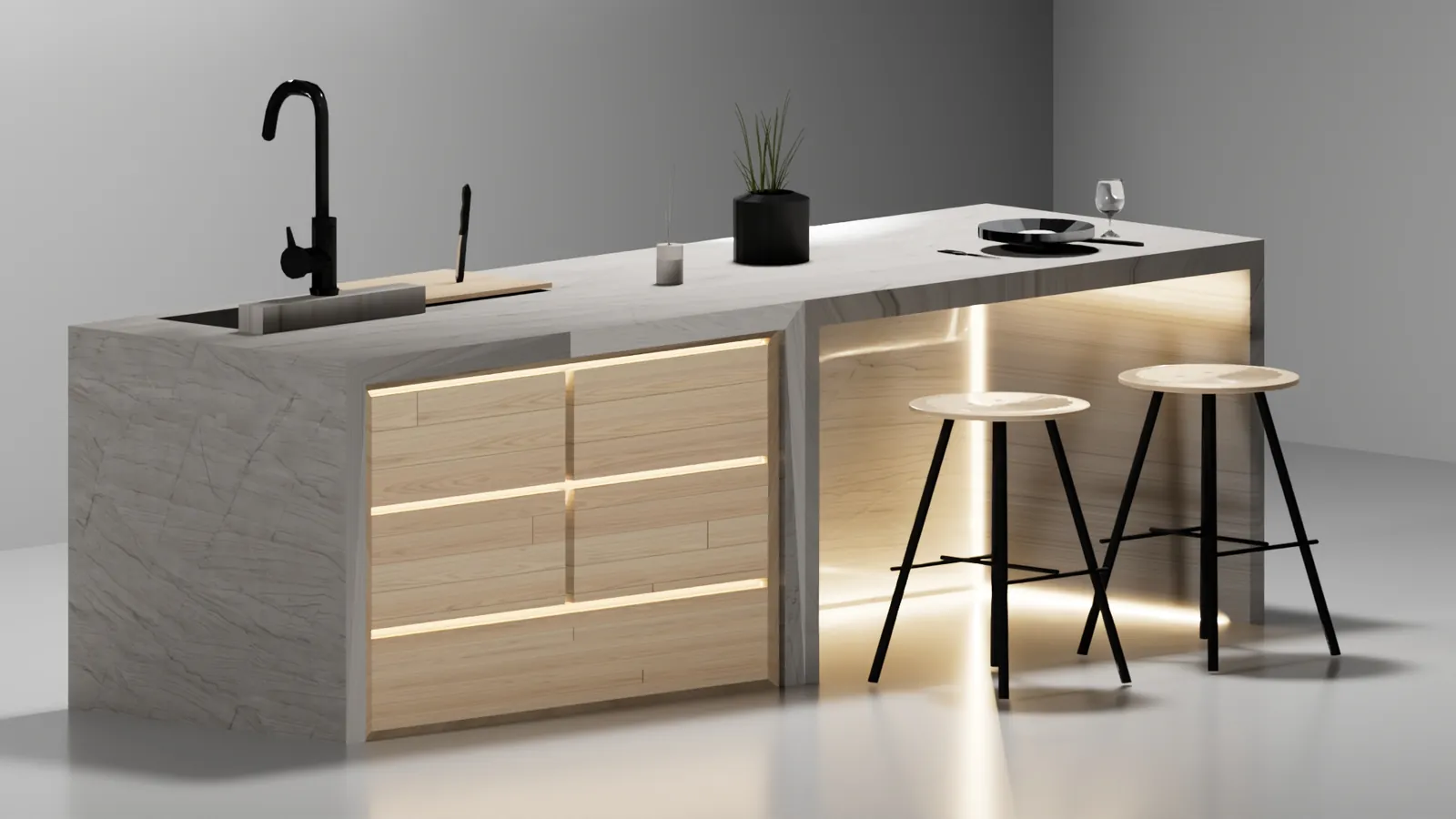
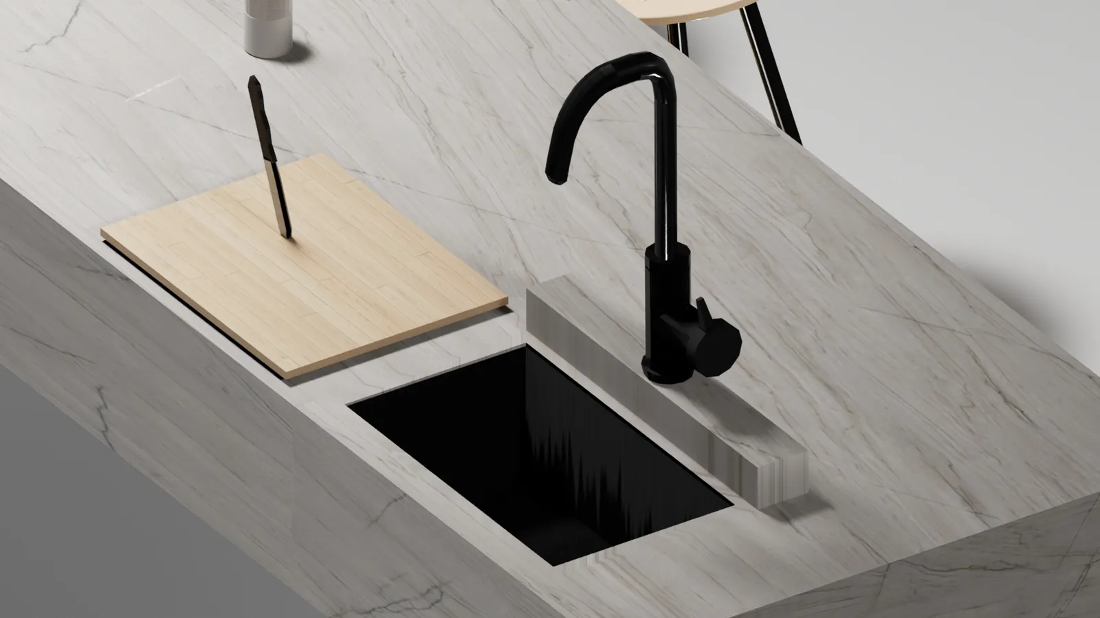
Fig. 11A wide shot and a detail of the same model; the veined stone and the warm under-light carry both.
Two years of foundations under every screen.
Colour studies, typography, image manipulation, digital illustration, photography, 2D animation and video production sit under all of the work above.
Knowing how a photograph behaves in a layout, or how a typeface holds up on an LED wall, is part of interface design. See the full timeline and course record →
Nudge, MyXR Lab and Coffee Je.