
Coffee Je: a slow-coffee brand, from concept to accessible system.
A brand and site for a fictional Setapak roastery, first built in Year 2. A year later I measured the contrast of every line of its text, found 30% of it below WCAG AA, and rebuilt it as a template system with no contrast failures.
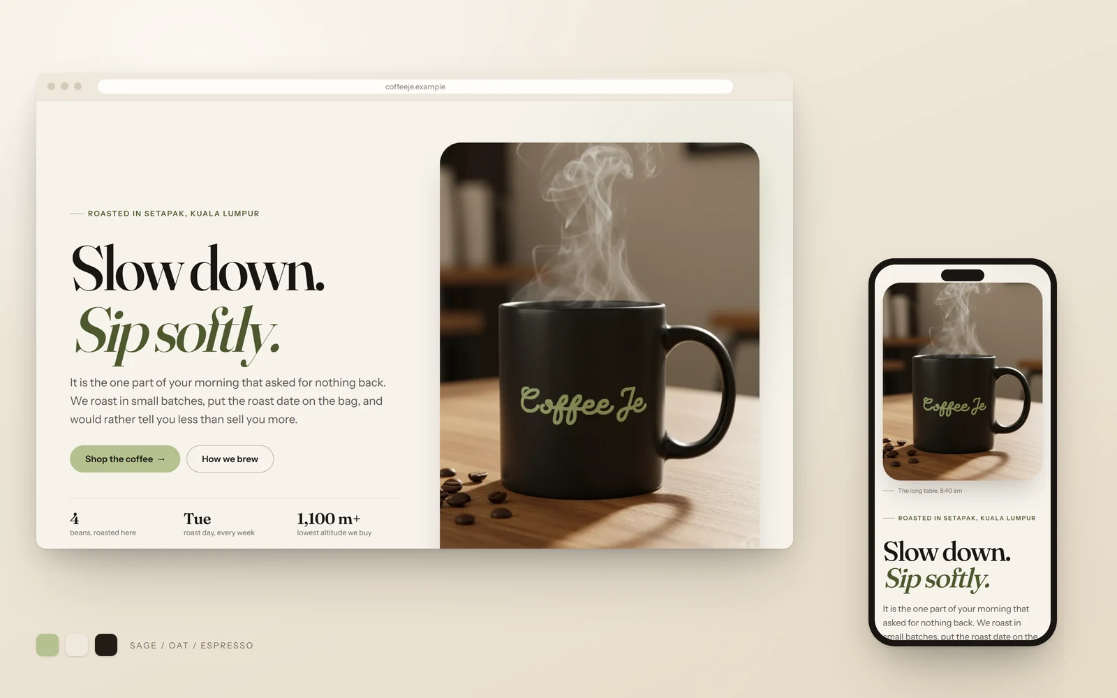
Fig. 01The 2026 rebuild. The tagline, the mug and the sage green are from the 2025 original; the type, spacing and contrast are new.
A coffee brand about the pause, not the caffeine.
The brief was a multi-page site for an invented product. Coffee fit, because the culture around it had drifted from relaxing toward productivity.
Coffee Je argued the opposite. The name borrows je, the Malaysian colloquial “just” — Coffee Je, just coffee — and the tagline is “Slow down. Sip softly.” For busy young professionals, the concept asked for white space, one action per section, and a first screen spent on mood rather than merchandise.
A year later, 30% of the text failed WCAG AA contrast.
I audited the original by measuring the contrast of every visible text node instead of judging by eye. 70 of 231 failed WCAG AA.
The cause was the palette itself. The sage green at the heart of the brand measured 1.96:1 on its cream background and the terracotta 2.08:1, and both carried headings and buttons across the site. The worst pair, white on peach, read at 1.66:1.
Most other faults came from structure rather than taste: the 19 pages were copied by hand instead of built from templates, so every mistake was repeated in every file.
InsightThe brand promised a pause, but the page never stopped moving. The rebuild had to let the page itself stay still.
The original ran a full-screen carousel that turned every five seconds, opened on a 128px headline, and set its cards breathing on an endless loop. The copy said slow down; the interface said hurry.
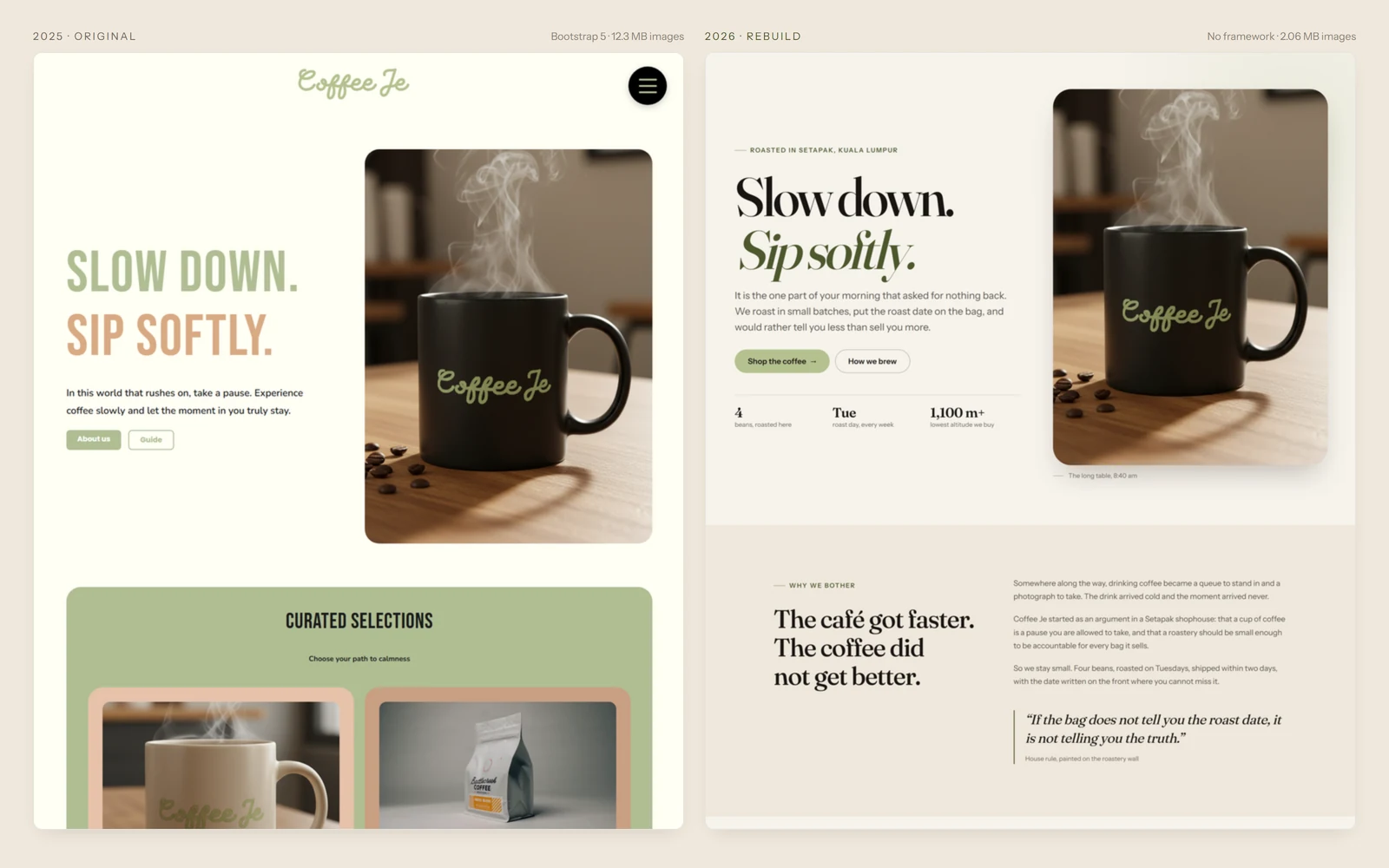
Fig. 022025 on the left, 2026 on the right. Same name, tagline, photo and green; the pale capitals and stacked rounded panels are gone.
Keep the brand, refine whatever works against it.
The name, the tagline, the sage-and-paper palette and the mood-first opening carried over. What worked against the calm did not.
The carousel and the looping cards went, and so did a headline sized through !important overrides at every breakpoint. Four font families with blurred jobs became two with clear ones: Fraunces for display, Instrument Sans for text, on one fluid scale.
One removal was not aesthetic. The community page paired invented testimonials with photographs of real Formula 1 drivers. The rebuild uses typographic initials instead, so no real face sits next to a quote that person never said.
Sage stays the brand colour; it just stops carrying text.
Contrast belongs to a pair of colours, not to one. The logo’s sage, #b5c18f, works as a surface but not as text, so it became a fill only.
Under ink text it reads at 9.50:1, where it once carried white text at 1.91:1. For links and small text I derived #4d582d: the same hue to within 0.6°, one step darker, at 6.91:1 on paper. The header logo got the same darker green, with its alpha channel unchanged pixel for pixel.
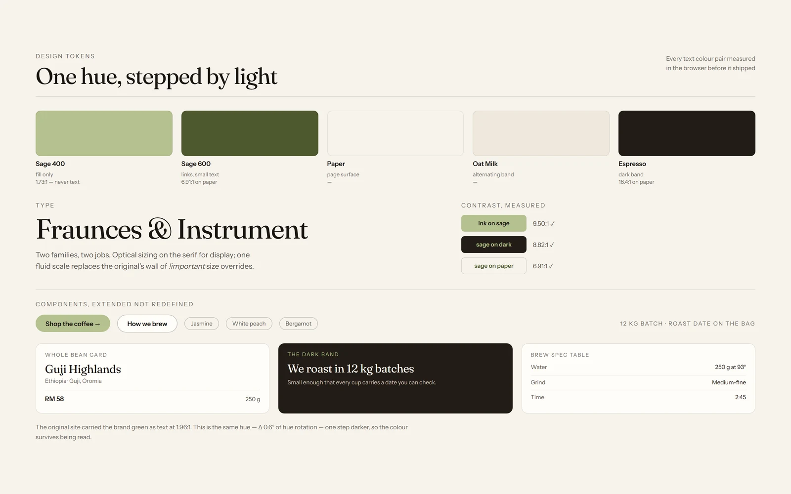
Fig. 03One hue, stepped by lightness. Sage 400 is marked “never text”; every pair on the right was measured in the browser.
Eight templates instead of nineteen copies.
The rebuild renders 8 templates into 17 pages with no framework, which makes most of the original’s faults structurally impossible.
There is one header and one footer, product data lives in one JSON file, and an unknown template key fails the build instead of rendering a blank. Images ship as responsive WebP with their sizes declared, so nothing jumps while loading.
Checking is part of the project. Scripts measure the contrast of every text node at 1440, 768 and 320px, drive the shop filter and mobile menu by keyboard, and confirm zero broken files when the site opens straight from disk. Any failure stops the run.
The rebuild was AI-assisted: the direction, design decisions and pass criteria are mine; the roughly 350-line build script was AI-generated.
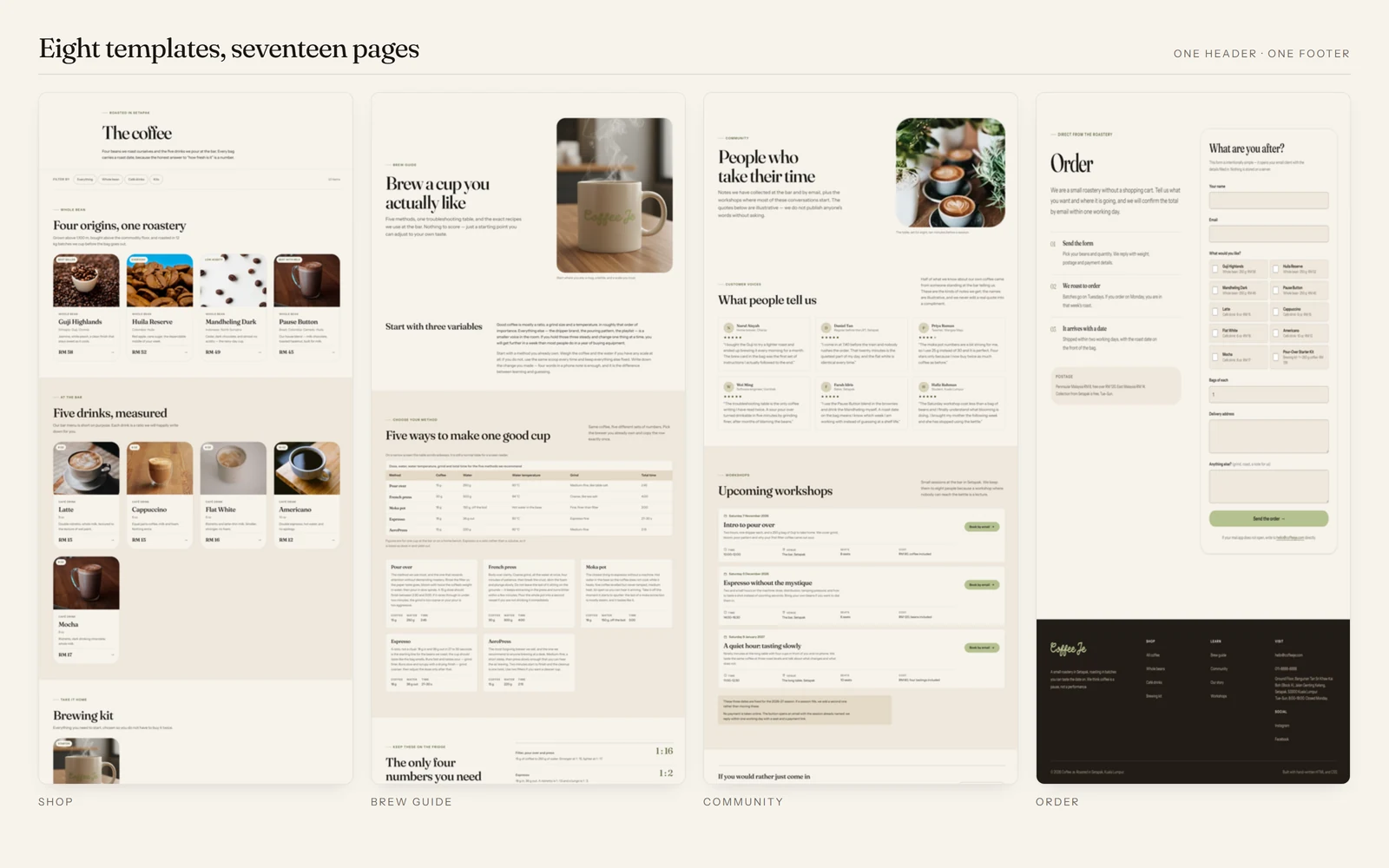
Fig. 04Shop, brew guide, community and order: four of the eight templates, sharing one header and one footer.
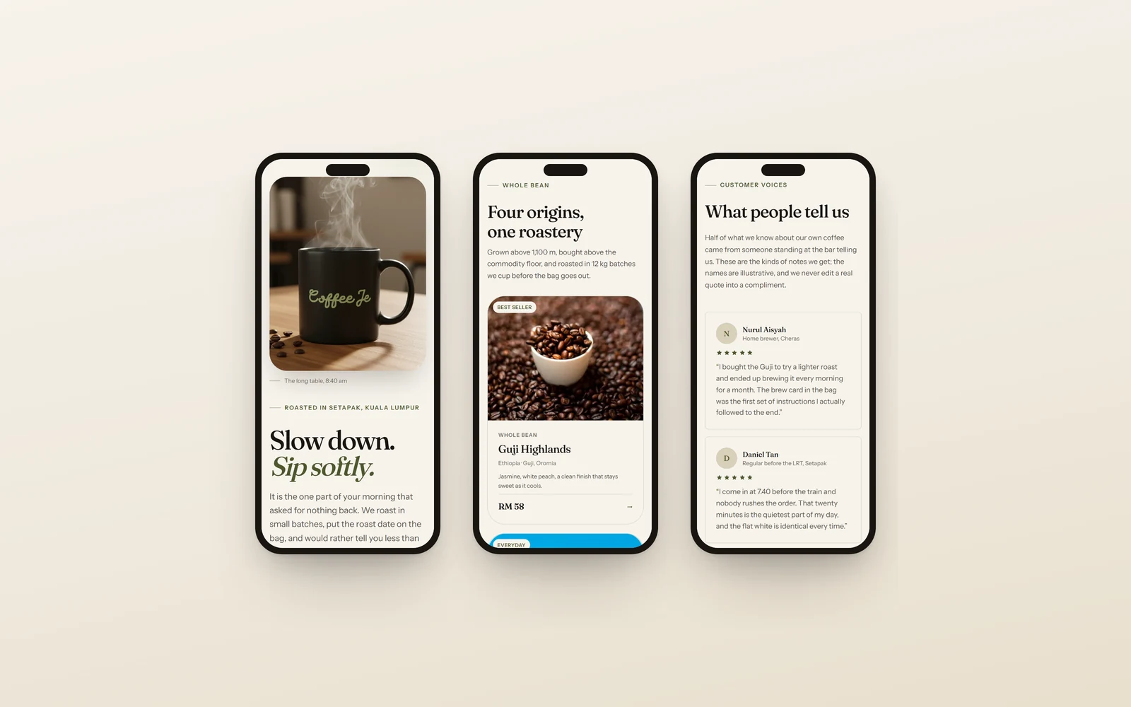
Fig. 05At phone width: home, the whole-bean shop, and customer voices with initials in place of photos.
Zero problems across 51 page-and-viewport combinations.
Text nodes below WCAG AA: 70 of 231 before, 0 of 4,931 after.
All 17 pages now load straight from disk; 8 of 19 did before.
Six comparable pages: 10,432 KB → 1,109 KB.
Every number here comes from a script that can be run again, not from a judgement call.
Horizontal overflow at 320px fell from 24px to zero, and images went from 12.3 MB to 2.06 MB as responsive WebP.
The site is verified. The brand is not tested yet.
The scripts prove the site is readable and unbroken; they say nothing about whether the brand lands with real visitors.
The next step is a user test of the brand proposition, alongside better product photography: the source images are only 320–440 px wide, and no code can fix that.
Nudge: a thoughtful pause before Buy Now, Pay Later.